Work2026
ArsonistAI
An AI design consultancy with two audiences on one homepage, enterprises hiring for AI augmented product work, and individual designers buying tools off the shelf.
- Role
- Front end build and design system
- Year
- 2026
- Live
- Visit the site
- Next.js
- React
- Turbopack
- Tailwind CSS
- Cloudflare Turnstile
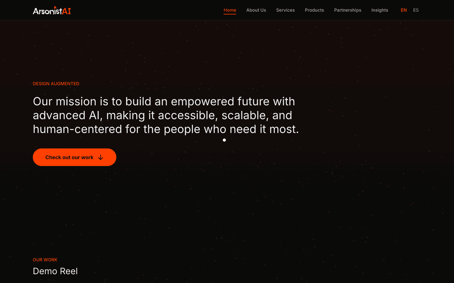
ArsonistAI runs seven services, from content generation to operations consulting to training teams on Claude Code and Cursor, and sells three self serve products beside them: a KPIs plugin, a portfolio tool, and a Figma business toolkit. That is two different businesses sharing one homepage, and the failure mode is obvious. An enterprise buyer evaluating a consultancy and a designer buying a plugin do not want to read the same page.
The problem underneath the brief
Most sites solve this by picking one audience and hiding the other behind a nav item. That treats the second audience as an afterthought, which shows. The actual fix is structural: let the services read as a consultancy's capability list, let the products read as a small, confident shelf of things you can just buy, and make sure neither section has to apologize for the other's tone.
7
Services listed
Content, concept visualization, exploration, experience optimization, product design, ops consulting, training.
3
Self serve products
A KPIs plugin, a portfolio tool, and a Figma business toolkit, sold without a sales call.
2
Locales
English and Spanish, resolved through the same path segment pattern as the multilingual travel sites.
How it is built
Next.js, built with Turbopack rather than the default bundler, on a design token system laid over
Tailwind rather than raw utility classes. Tokens are named in the Material 3 convention,
text-label-lg, rounded-shape-full, but the palette underneath is the brand's own lava red
rather than Material's defaults. That distinction matters more than it sounds: it gets the
discipline of a token system, consistent spacing and type scale across seven service pages,
without inheriting a design language that has nothing to do with fire.
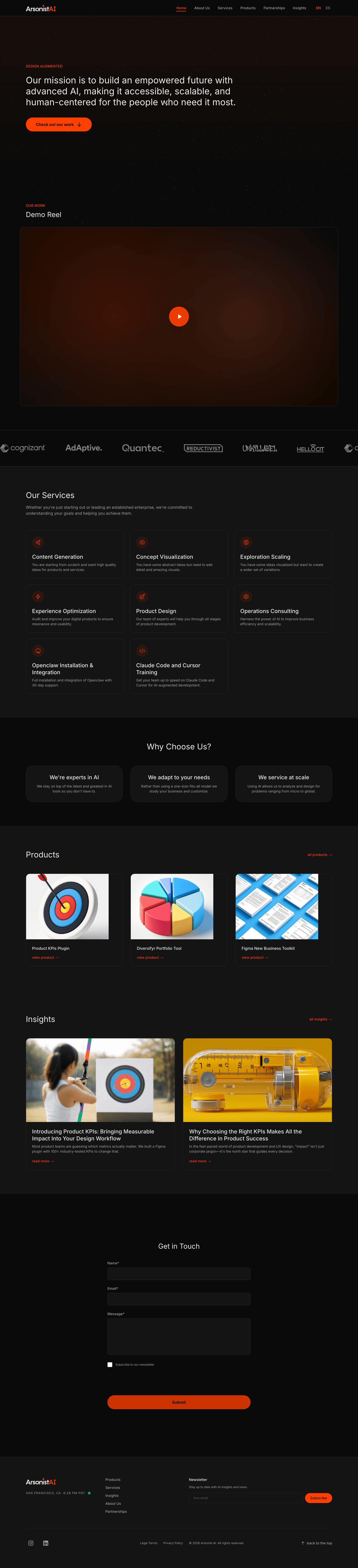
The contact form runs Cloudflare Turnstile instead of a visible CAPTCHA, which keeps the one
action an enterprise lead actually needs to take, send a message, from competing with a puzzle.
Locale routing follows the same path segment pattern this portfolio uses elsewhere: /en and
/es resolve through one route tree, the same trick applied to a fire themed design consultancy
instead of a travel operator.
What I would keep
Letting the services and the products sit in genuinely different registers on the same page, rather than forcing a single tone to cover a consulting engagement and a plugin purchase. Buyers in each category never have to translate the other section into something that applies to them.