Work2025
HCIT
A five vertical AI and infrastructure integrator whose site had to make enterprise grade credibility legible without turning into an alphabet soup of sub brands.
- Role
- Front end build
- Year
- 2025
- Next.js
- React
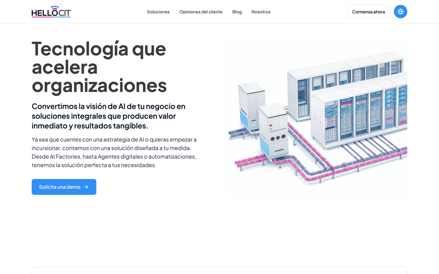
Hello CIT sells infrastructure, AI agents, telecom, custom software, and cybersecurity, and named every one of them starting with the same word. That naming decision is either the thing that makes five unrelated service lines read as one company, or the thing that makes a visitor scroll past all five without remembering any of them. The site had to make it the first one.
The problem underneath the brief
An integrator selling to enterprise buyers has one job before anything else: prove it belongs in the room with Nvidia and HPE, not just that it resells their hardware. That proof cannot live in a paragraph of copy, because every integrator's paragraph says the same thing. It has to live in the structure of the page, in how fast a buyer can see the certifications, the client roster, and the specific vertical they came looking for.
5
Service verticals
Hello Infrastructure, Hello Agents, Hello Phone, Hello Code, Hello Cybersecurity.
3
Featured solutions
AI Factory, AI Agents, and Digital Power sit above the vertical list, not inside it.
7
Enterprise client logos
Nvidia, HPE, Huawei, Lenovo, Fortinet, Check Point, and Commvault, all above the fold.
How it is built
Next.js on the front end, with next/image doing the heavy lifting across the client logo wall
and the hero, where a dozen vendor marks and a rotating solutions banner would otherwise be the
slowest thing on the page. The page order was the real design decision: solutions overview first,
then the client logos and testimonials, then the FAQ, then team bios, with the blog and contact
forms doing the closing work at the bottom.

Putting the certifications, ISO 9001, ISO 37001, NVIDIA HPC, PMI, ITIL v4, and Huawei HCSA, in the same visual register as the client logos rather than buried in a footer was the other lever. A certification list reads as compliance theater on its own page. Beside the Nvidia and Huawei marks, it reads as evidence for the claim the logos are already making.
What I would keep
Ordering the page around proof before pitch. An integrator's buyer already knows what an integrator does; what they are checking is whether this one has done it for a company their size, which is exactly what the logo wall and the certification list are there to answer.