Work2026
Cytron Motorcycles
A Tokyo motorcycle brand invented end to end, drawn as a working prototype and then built as the site that prototype had been arguing for.
- Role
- Design and build, end to end
- Year
- 2026
- Live
- Visit the site
- SvelteKit 2
- Svelte 5
- GSAP ScrollTrigger
- Paraglide
- Vercel
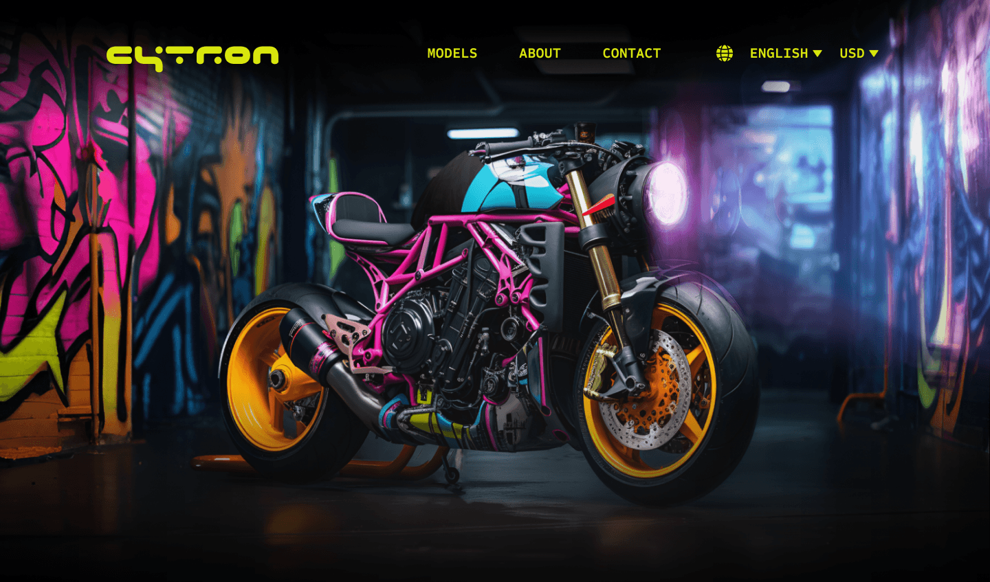
Cytron builds custom streetfighters out of a workshop in Taito City, and every word of that sentence is invented. The brand has no factory and no catalogue. What it has is a range of ten bikes, a header in six languages, an enquiry form that reaches somebody, and a homepage that now runs in a browser rather than inside a prototyping tool.
The problem underneath the brief
A concept brand is the easiest thing in the world to design badly, because nothing pushes back. There is no client to say the bikes do not look like that, no CMS to say the copy will not fit, and no engineer to ask what happens on hover. The work either invents its own resistance or it produces a very pretty picture of a website that could not be built.
So the constraint I set before drawing anything was that the file had to behave like a prototype, and that whatever the prototype claimed had to survive being built. Every state a visitor could reach existed first as a real variant and later as a real component, and nothing was allowed to stay a note in the margin about what would happen if you moused over the card.
10
Models in the range
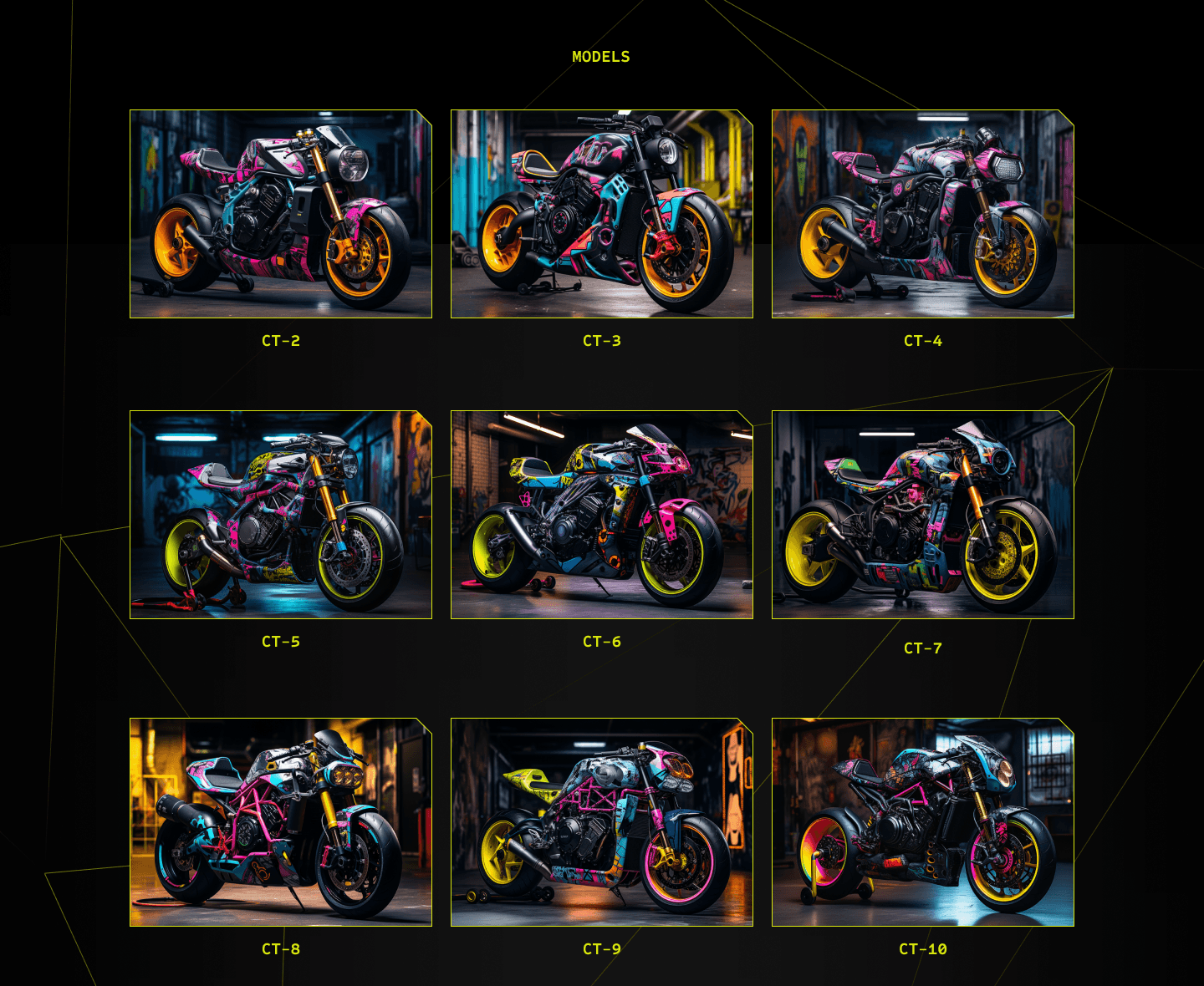
CT-1 holds the hero. CT-2 through CT-10 fill the grid underneath it.
16
Components with a second state
Every card, nav item, button, and scroll cue drawn twice, so every state was real before it was built.
6
Languages in the header
English plus five more, each named in its own language, with a currency switch beside them.
Why SvelteKit and not the usual thing
Almost everything else I ship is React on Next.js, and reaching for it again would have answered a question I had already answered several times. Cytron is a page whose entire argument is motion. A card has to grow without shoving its neighbours, a lime wireframe line has to run the length of the document without tearing, and the whole thing has to hold its frame rate on a mid range phone. That is a budget problem before it is a component problem.
Svelte compiles its components away, so what ships is the work the page does rather than a
runtime plus the work the page does. Svelte 5 runes hold the hover and variant state, form
actions in +page.server.ts take the enquiry without an API route sitting in front of them, and
GSAP ScrollTrigger drives the single continuous vector that crosses every section. The six
locales come out of Paraglide, which compiles messages the same way Svelte compiles components,
so a language nobody picked costs the visitor nothing at all.
Drawn as a prototype, then built as one
The model card is where the discipline paid for itself twice. In the file its default is 360 by 248 and its hover is 400 by 275, drawn side by side in a component set rather than described in a comment. In the build that pair collapses to one component and one scale transform, because the two frames share a ratio and the design meant a bigger painting rather than a bigger box.
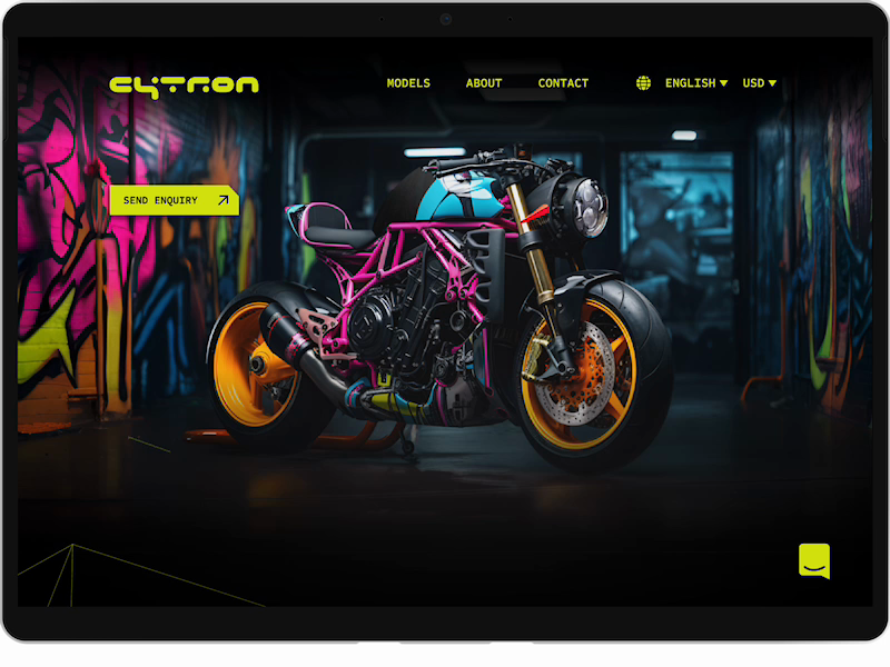
The enquiry button does the same thing, and its hover does something specific. The arrow rotates from a diagonal to a horizontal, a forty five degree turn that only becomes a decision once somebody has drawn both frames. A sticky note parked beside the button on the canvas says people are more likely to click a button that has an arrow on it, which stayed true once the button was a real button that real hands could reach.
The six feature icons are held together by the same habit. A second note on the canvas set the rule that they match in complexity and in whether they are stroked or filled, and that each one is named for what it is used for rather than for what it draws. Six icons is exactly the number where that rule stops being obvious and starts being necessary, and it is the reason they left the file as one sprite rather than six separate arguments.
What the build caught and the file could not
A design file cannot tell you that you got a word wrong. The language menu lists its options in their own languages, which is the right instinct and the reason the pattern works at all, and the drawn version then got two of the six wrong in the same breath. French is written francés, which is the Spanish word for it, and Chinese is written 中国人, which names a person rather than a language. Nothing inside Figma can raise its hand about either. A locale file can, and did: the keys were right and two of the strings were not, and neither survived being typed into a catalogue where every language has to sit in the same column.
The same gap showed up in the feature copy, where three of the six descriptions were still lorem ipsum, and in the testimonial, where the quote was the words "It was a very good experience" attributed to Dave. In a picture of a website those read as finished. In a built one they are the first thing a content pass deletes, and that is exactly what happened to them.
What I would keep
The rule that a state has to exist before it can be claimed. It is the same rule I would apply to a component library, and applying it inside a design file is what stopped that file from being a mood board with a nav bar on top. It is also what made the build short. Ten bikes, six languages, and one continuous lime line took less time to write than the file took to draw, because every question the code was going to ask had already been settled on the canvas.